01 · Overview
A reminder should help someone act.
I explored how an electricity bill reminder could help people review a bill, choose the right action and understand its latest status when they return.
The concept connects reminders, bill details, payment outcomes and All Bills into one journey. I worked through the product scope, interaction flows, interface system and clickable prototype, including the situations around an incomplete or unsuccessful payment.
02 · The problem
The same reminder can meet four different situations.
Sending a reminder is only the beginning. People may have already paid through another app, be waiting for confirmation, or need to recover from a failed payment. I focused on giving each situation a clear status and a useful next step.
“I still need to pay.”
Review the bill and continue to payment.
“I paid somewhere else.”
Update the bill without making another payment.
“Has my payment gone through?”
Check its status while confirmation is pending.
“The payment failed.”
Understand the debit status and review before retrying.
Design scenarios used to structure the journey.
03 · Core journey
One bill, connected from entry to outcome.
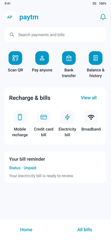
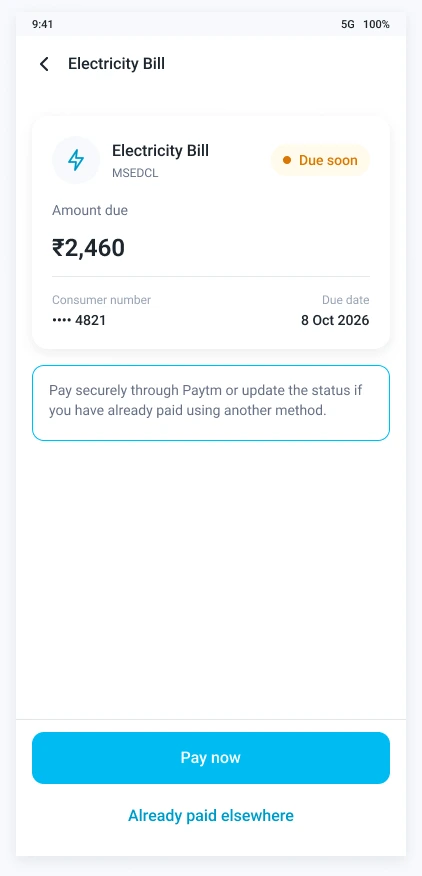
People can enter from a reminder or the Electricity Bill option on Home. The bill details bring the amount, due date and account reference together before the user chooses what to do.
- 01Open Electricity Bill
- 02Review bill details
- 03Confirm payment
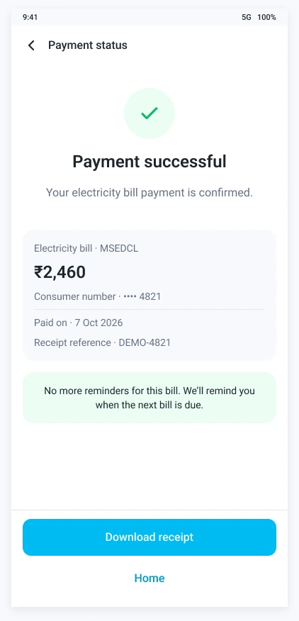
- 04See status or receipt
The journey also branches into paid-elsewhere updates, pending checks and failed-payment recovery. All Bills gives people a place to return to the same bill and its latest status.
04 · Key design decisions
Make the next action fit the bill’s status.
Let people update bills paid through another app.
I included an “Already paid” option because people may use different apps to pay their bills. The flow asks for confirmation and labels the result “Marked as paid by you,” keeping it distinct from a payment confirmed through the app.
See the paid-elsewhere screen ↓Explain what to do while confirmation is outstanding.
I added a clear pending state, a way to check payment status and guidance to avoid paying again while the result is unresolved. The person can return Home without losing that context.
See the pending screen ↓Review before trying a failed payment again.
For the confirmed failure scenario where no money was deducted, users can review the bill and payment method before confirming another attempt. This keeps retrying an intentional action.
See the failure and retry screens ↓Keep the latest status within reach.
Home provides the entry point through Electricity Bill. All Bills keeps the latest status accessible, and the final Home buttons let users leave the transaction flow without losing that context.
See All Bills ↓05 · Visual design
A consistent language for each next step.
Shared typography, reusable controls and a clear action hierarchy connect the screens. Status messages use text and symbols alongside colour to explain the outcome.
Select any screen to view it full size.
06 · Explore the prototype
Start at Home. Follow the bill.
Open Electricity Bill to explore the main journey. The prototype also includes paid-elsewhere updates, pending status and a failed-payment retry flow.
Interactive Figma concept. Payment processing and status responses are simulated. This is an independent exploration, not a commissioned Paytm project.
07 · Reflection
The experience continues after the payment button.
Working through these scenarios helped me think beyond the payment button. The experience also needs to explain what happened, what someone can do next, and what they will see when they return.
My next research priority is checking whether people understand the difference between a confirmed payment and a bill they have marked as paid themselves.